
Our lives all look pretty different, and we all have different ways of organising them. This is reflected in the myriad of systems and layouts we each have to organise our Filofaxes. Some people don’t feel comfortable with the list and block layout that most diary inserts take, and there’s been quite a lot of interest in systems which provide a more graphical representation of our days.
These systems make use of our familiarity with analogue clock faces and develop from there. There’s a basic problem with a clock to show our days because one round of the clock only covers half the hours of the day, so many of these graphical systems have had to evolve away from the clock face and use colour coding to increase the visual usefulness and impact of the graphic. There are also the inevitable clashes between systems using a 12-hour clock system (most of them), and those using a 24-hour system (my own preference).
I have seen inserts with two empty clock faces on each day’s page, one for the morning and the other for the afternoon and evening, but I find these confusing. I automatically continue planning after midday on the morning clock face, forgetting to move across to the other. This isn’t a system commonly used and a more refined system is called for.

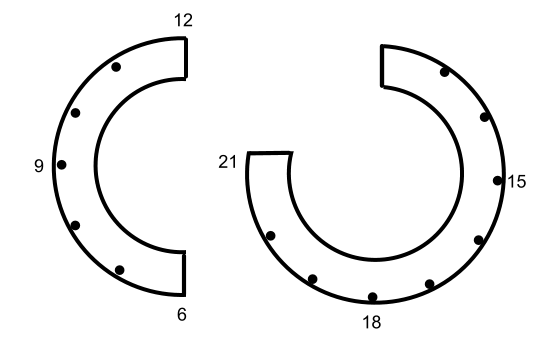
Patrick Ng’s Chronodex system (see his blog at http://scription.typepad.com/blog/2011/11/scription-chronodex-weekly-planner-2012-free-download-with-the-cost-of-a-prayer.html#.U4XWNzjBZaQ ) might have been the one that gave this move towards graphical daily planning wings. It pulls the two clock faces into one, being based on a typical 9 to 5 working day with space for a few hours before and after to plan events outside those times. The single graphic covers 18 hours, and when it’s filled in it gives the most pleasing representation of time of the systems I’ve tried.
However, planning anything in the hours outside 09:00 to 21:00 is ineffective, and its spiky layout and initially unintuitive nature has put people off and set them looking for alternatives.

The Chronodex
Kent from Oz created the popular Spiraldex (See his video and blog post), which is visually more pleasing to many than the Chronodex system and, by moving a step away from the clock face paradigm by using a spiral, it allows more hours to be planned. Several people have made their own versions of this to suit their own lives, for example the Pingadex (blog, and video) .
There are aspects of this device that I find problematic, though. Each hour’s segment doesn’t get the same amount of space, and whilst there is space to write notes outside the segments between 12:00 and 21:00, this isn’t the case for the hours between 6:00 and 12:00, so notations are often written with lines or arrows crossing the other segments. My sense of balance and symmetry is easily offended, and this doesn’t really help me to visualise my day.

The Spiraldex

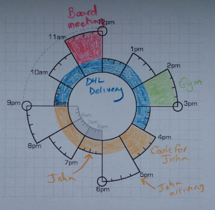
My own thoughts and preferences, like everybody else’s, is relevant to my own situation. I don’t have a 24-hour lifestyle and don’t generally need to refer to what happens before 8:00 or after 21:00 (though if I am doing something during those times I would need to be able to add it or draw it in somewhere). My life also isn’t event orientated and most of what I do is recurring, so I manage tasks on a computer, not in my Filofax. I really want to be able to see at a glance not only what I have to do, but how much time it will take and therefore how much time I have left over. I wanted equal spacing for each time period, I wanted something that distinguished mornings from afternoons, and I wanted spacing around all sections for any relevant notations.
This is my initial attempt.
When filling it in, I draw a line to show a time period where something is happening or may happen, but which won’t occupy time completely, such as a delivery window, and fill the segment with a block of colour when there is a fixed appointment where nothing else can be planned. As the segments are the same size and all have a space around them for notes, this allows me to easily review how much time is assigned and how much is spare.

This is clearly just a prototype. The graphics need sprucing up and the 21:00 and 15:00 aligning, etc. It might be improved by thickening the bands, only starting at 8:00 in the morning, adding more concentric rings to help with colouring in, drawing lines to delimit the hourly segments, adding 15 minute dashes and adding more hour numbers. I’m very open to hearing what people think of this system and how it could be tweaked to make it more useful to more people with different ways of working.
Feedback? Let me know!
Graham Rhind http://www.grcdi.nl/author.htm
I really like the way you have split the morning and afternoon which would help me avoid mix ups at a glance.
ReplyDeleteThanks Morag!
DeleteThanks for showing the comparisons, it is food for thought. I can't get my head around the Chronodex one - I want to push all the pieces in to make it look neater!
ReplyDeleteThanks for posting this Steve - I've updated my dex graphics since writing this post - you can see the newest version at https://dl.dropboxusercontent.com/u/450542/Dex05062014.png
ReplyDeleteThis is really great, I like this very much. I have never really been able to get my head around this type of visual, but your prototype is great!
ReplyDeleteThanks Nellie! My most recent attempt is at https://dl.dropboxusercontent.com/u/450542/Dex05062014.png
DeleteI think it's really interesting to see the "historical" progression from a clock face. I tried for a while to use the Chronodex. It didn't work out. I realized that in order for me to see things quickly, the format needs to be laid out in a list, time format that I can remember. The Chronodex is too clumped up, for lack of a better term. I discovered a vertical week on two pages type of layout from Poochie Baby that uses a fold out with tasks on the flip side, kind of a la DIYFish inserts. I modified it slightly and it is working well right now for me.
ReplyDeleteAnd that's what I love about this web site. It leads you to the creative talents of the Filofax community as a whole, for experimentation and adaptation to your own needs.
I get your point completely - I also find myself writing the events with times in a list next to the graphic. What the graphic really helps me with is not necessarily seeing when something will happen, but how much time is used/is spare.
DeleteI think this is an interesting idea but my ADHD mind isn't letting me get it. I think I just need to play around with it so I can get it. I do like the idea of splitting the clock into separate segments. I would rather see morning, afternoon and evening, though. That's how I plan my day.
ReplyDeleteI never thought I would "get" seeing my days in anything other than lists and boxes, but I've started using a type of graphical representation of the days. I couldn't make sense of the Chronodex--as several have said here--but I did find Maryanne Moll's Hyperdex on her Etsy shop and YouTube videos, showing how she uses them in her Filofax, and that made sense to me. As you've mentioned, I find the circular layout really helpful for tracking how much time I spend on different tasks, not so much for scheduling or planning. I'm an academic and I usually have several different types of projects all going on at the same time, and most of them don't have hard-and-fast deadlines. And--to complicate matters even more, they're usually the kinds of projects or tasks that a person could work on for much, much longer than effective or necessary. So that's why tracking my time has gotten to be crucial for me, and it's why I'm really interested in these graphical representations of days. I really like yours--especially how you've distinguished clearly between morning and afternoon. Really nice. Thank you for sharing your system.
ReplyDeleteThanks Cathy. If you have any ideas on how it might be improved or made more useful to your situation, let me know.
DeleteI wrote about these circular visualisation tools a while ago. http://www.mylifeallinoneplace.com/2013/12/going-round-in-circles.html - I have problems with them.
ReplyDeleteI agree. I'm very graphical but find these perplexing!
DeleteI've made a video outlining some of the systems I described in my post, and developments in my own system (now christened Zirkuluak) - https://www.youtube.com/watch?v=nXoAvmlittE
ReplyDelete